
It is easier to promote a new game if you have interesting screenshots and a catchy cover image. So I began planning what would be the first version of a key visual for our new game “Good Company” about three weeks ago. To come up with a good concept I first gathered reference from the game itself and from inspirations we had defined in the very early stages of the project. It was important for me that the final image would be a representation of the game and its looks but also introduce a slightly new aesthetic for possible graphics and advertisement images inside the game. The visual style of images that “lives” in the game, so to speak.
To start off, I asked myself what we already know about “Good Company”. What’s the style and what are essential elements of the game? So together with the rest of the carrot team, I collected some keywords that I would try to incorporate into the final image. You can see those key expressions and the references that I took from our production so far in the image below. It also contains our color scheme, which we defined to keep an overall consistent look in the game.
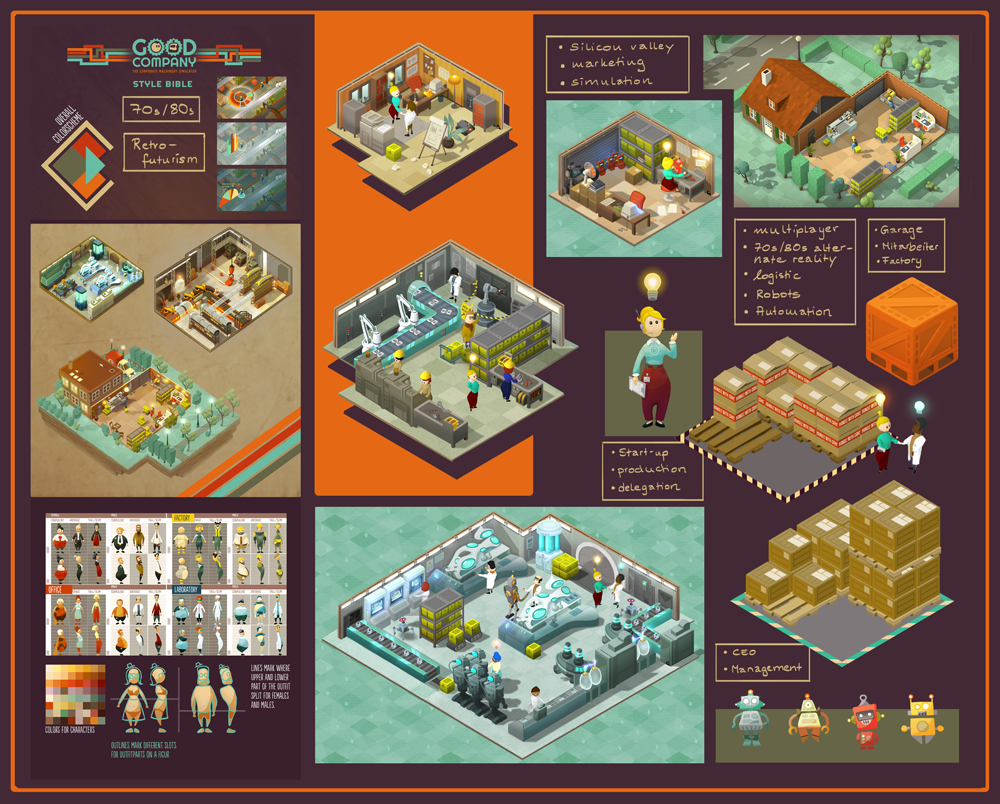
So this gave me ideas for the content that I wanted to include into the key visual. Next step was to find the right style. The visual style of “Good Company” is cartoony and colorful. What kind of style do we want for the key visual? What are good references?
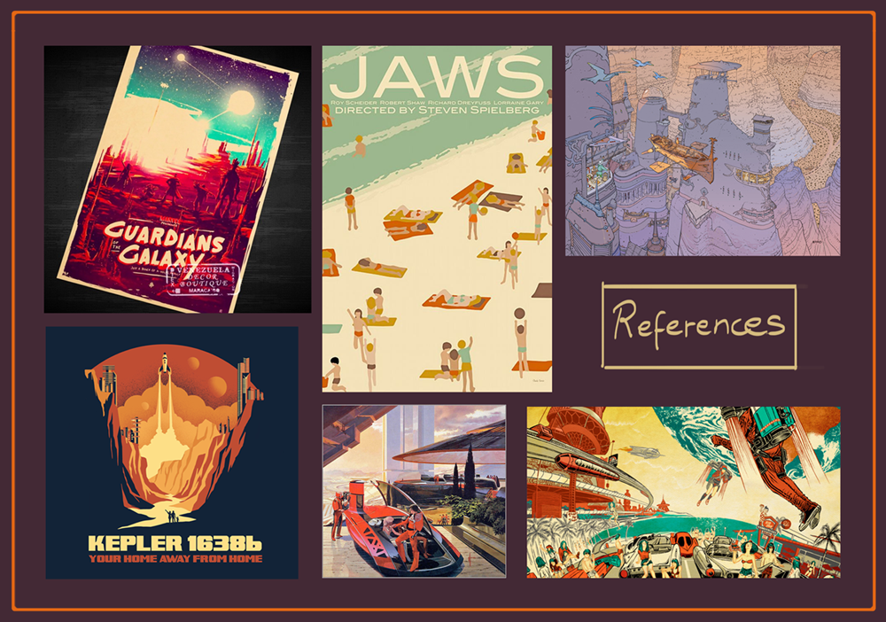
Earlier we had the idea to create advertisements for “Good Company” products in the style of 70s tech advertisement posters and we also knew that we wanted to try some kind of illustrated film poster look. So I searched the internet for references that were going into the directions mentioned. I also already had in mind to maybe try something with outlines, having blueprint aesthetics in mind. You can see some of the inspirations I used in the collection below.
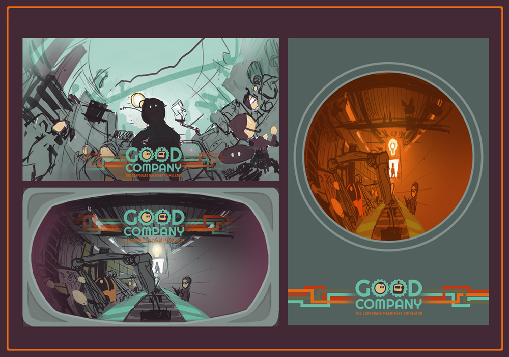
To get my first very rough ideas down I just started scribbling without thinking too much about the final style or colors. It was more important to get the ideas out of my head. Since we want “Good Company” to be a game in which there might be a lot of stuff happening on the screen at once, I wanted the key visual to reflect the crowdedness. There are a lot of employees and processes to be delegated and so I needed the image to feel overwhelmingly full of elements. The CEO/player was going to be in the center of everything, confidently managing their company. We also decided that the key visual should be in a format printable on a tall banner later on and so I thought about a way to translate my idea into a vertically scaled version.
I would usually do more thumbnail scribbling in the beginning, because I often find that good ideas like to hide behind first, more obvious ones. In this case, this one was first and it was obvious, but I liked it a lot and so I thought I would try to go further with the concept.
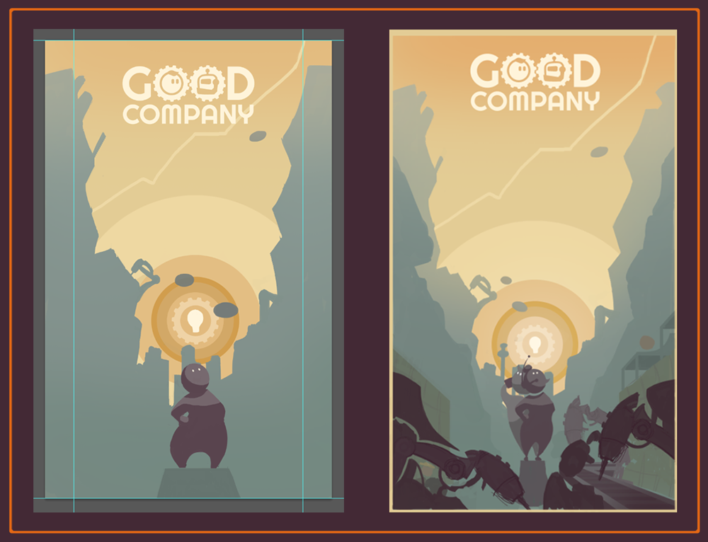
As I mentioned, we wanted to make sure that the key image allowed for a strongly vertically print for future banners of “Good Company”. So I started a first, very vertical sketch using colors that I imagined could fit. I tried to stay very abstract and simple, concentrating and emphasizing shapes to create an appealing composition. I found that in a lot of retro illustrations the image is composed using big and bold shapes. My first step in that direction was the circular sun/light bulb element in the background. It was also important for me to include the game’s logo right from the beginning, so I would not have the problem to somehow fit it in later on. Another early addition was the second CEO. “Good Company” is a multiplayer game and we wanted to show that to a potential player at first glance.
After adding first elements in the front I got the feedback that the robots turned out a little to alien-like and scary due to the sharp and organic shapes. Although I really liked the shapes for the overall image composition I had to change that impression, of course. I added more elements in the lower part of the image. First I only suggested what they might represent later on. I had to fill the big shapes with the planned clutter of office, factory and laboratory equipment and staff sooner or later, so better start somehow.
I have to admit, I lose the overall feeling for the colors in a painting unless I make sure I have other images to compare it to. I need a reference point outside the canvas I am currently working on to see whether the contrast works, the colors are saturated enough etc. So I had to find that the progress so far was kind of dull color wise. It was a good time to check out other color combinations. So I asked Photoshop for all its awesome sliders and blending modes and created a variety of colored versions of my initial design. I picked seven of them to discuss them with my team-mates.
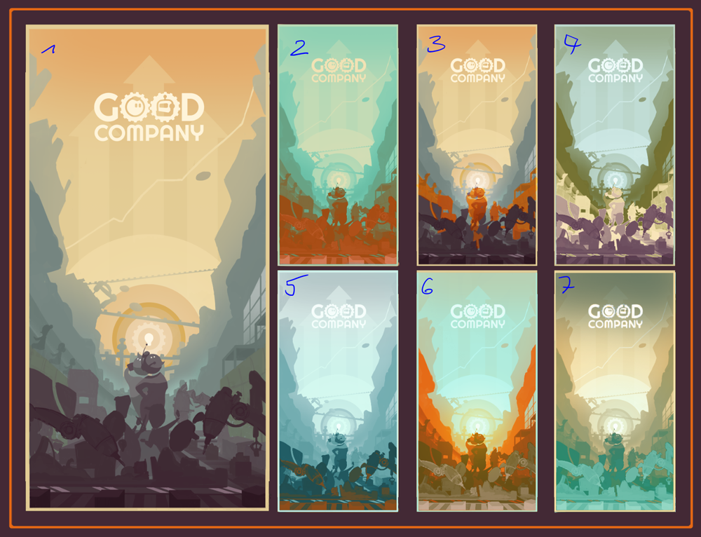
If I remember correctly we went for 1, 3 and 6 as possible directions for color. As you can see in the following image I used the colors from those versions, but composed them differently. I emphasized the shapes and their clear separation and introduced outlines to make it look more graphic. And since I was still in a very early stage of the process I tried another idea that I had in mind, which was even flatter and more abstract. The carrot team decided that the first concept was better, though, and so that’s the one I continued with. Since our CEOs in the image looked rather scared, surrounded by evil robot-aliens and calling for help, I changed their posture and and position a little to make them look more confident and in control.
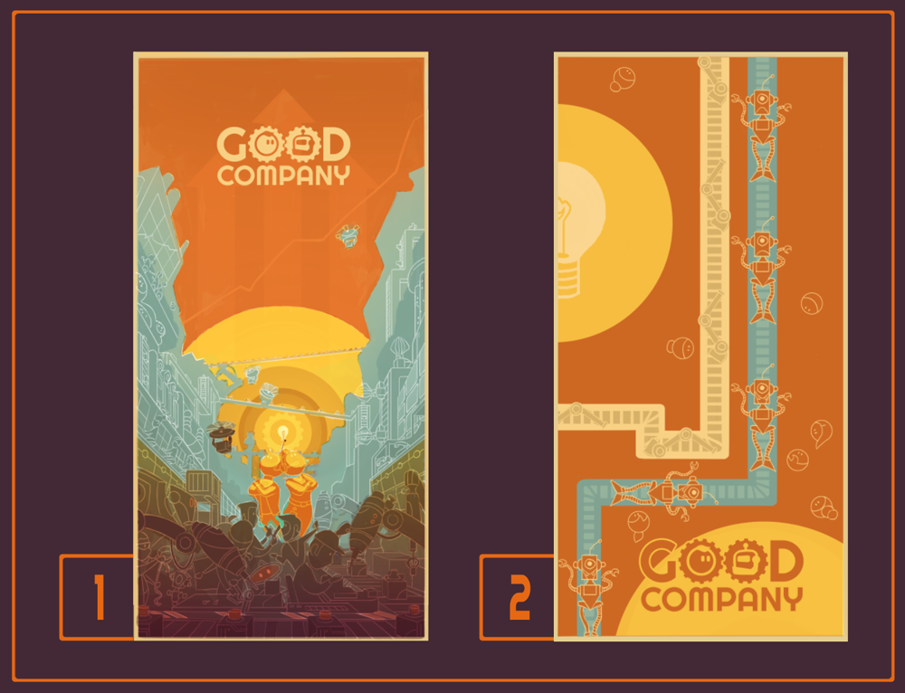
As I said, feedback was clear, left one still ruled, but it seemed like I went a little to 70s with the colors. We didn’t want them to be yellowed and muddy but rather more saturated and bright, going more into the retro-futuristic direction. A wise decision if you want something that catches people’s eyes. So brighter colors and more bold, elliptic shapes were added, showing some conveyor traffic.
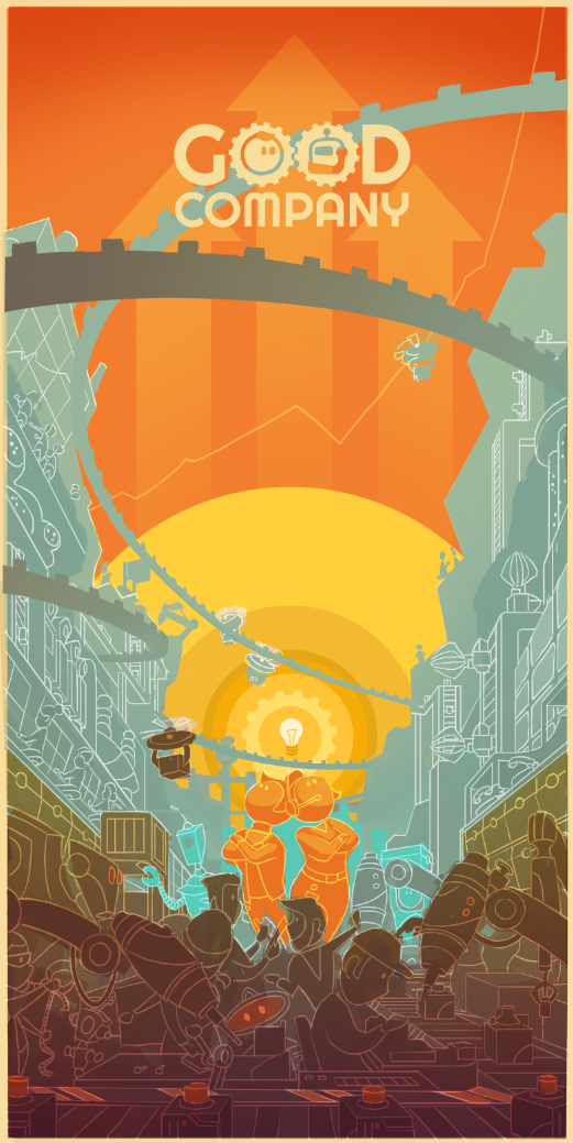
I widened the image, so it would be easier to crop it to any format possibly needed later on. The outlines were defined on a separate layer. First only in one color, so it would be easier to make changes later on. I already knew that I wanted the color of the outlines to vary depending on their surrounding colors, but it would have been too complicated to draw the colors in directly..
The big sky shape was very important for the composition but I found it a little boring and thought about adding clouds. But since “Good Company” has not much to do with being outside or anything that would justify clouds in the key visual, other than Chantal would really love to paint some clouds, I had to come up with something theme related. I thought that dollar bills would cover another important aspect of the game since as the founder of your company it is one of your biggest interests to make money and grow. So, just like cute, little clouds there are now “Good Company” dollar bills flying through the wide, orange sky.
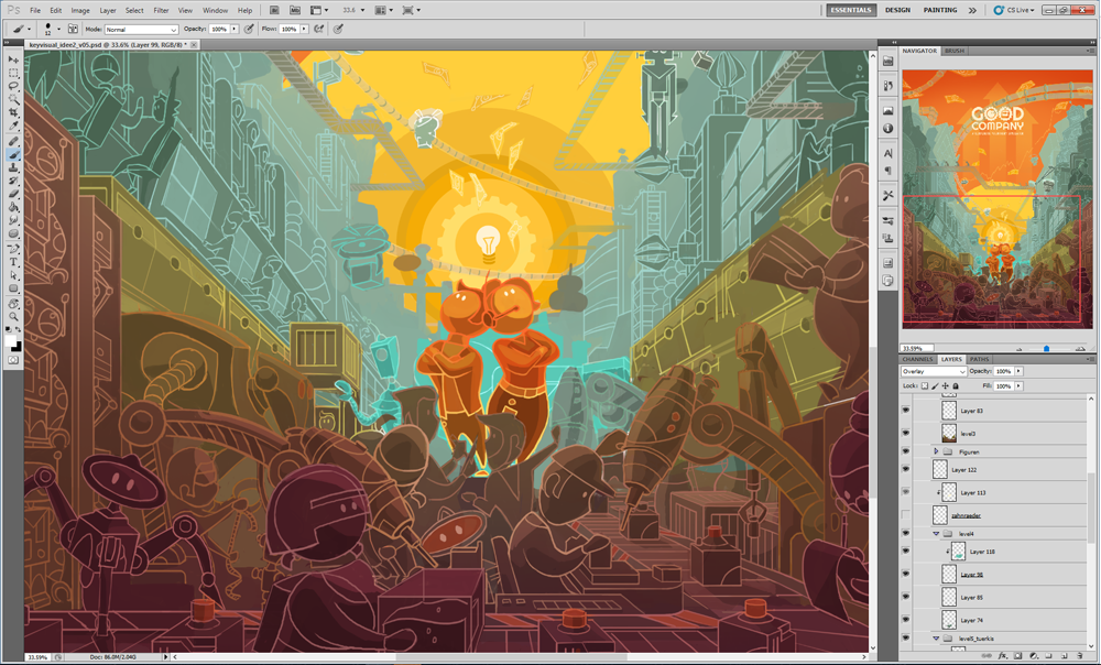
After that, I cut the outline layer and attached the pieces to the different elements in the image. As you can see I used the outline color to support the surrounding colors or even make elements pop out, like the two CEOs. Their outlines run from orange on top to yellow at their feet, contrasting the value and color of their surrounding shapes.
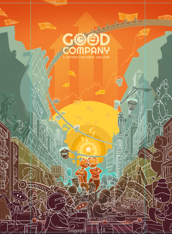
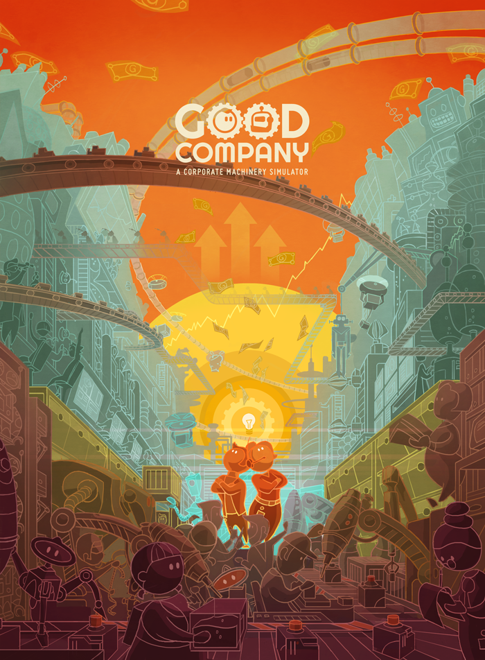
Finally, I filled the still empty shapes with equipment, robots and employees scaled and moved elements to improve the composition and make it work with the “Good Company” logo. This lead to the current final version below. I will not promise that I won’t make any more changes to the image in the future. But for now, it works.
As a fan of 70’s tech posters myself, I think you’ve done a fantastic job here. Great work illustrating your whole creative process; I enjoyed it, Chantal! Will be keeping an eye out on any subsequent tweaks you make. 🙂
Hi Sean, thank you very much for your comment! I am glad you enjoyed reading the post and that my thoughts during creating the image became somehow understandable 🙂