
Welcome to another overview of the design process for Good Company!
Managing a small or big company that manufactures robots in all variations and sizes means you also have to manage a lot of different products, intermediate goods, and materials. As a player of Good Company, you want to have a good overview of the items in your inventory to efficiently produce, research and create. Since production starts on a very basic level, where employees can combine plastic cases with wheels and batteries, and possibly ends with complex and specialized machines, the items you have to deal with might vary significantly in size and complexity. Therefore, we wanted to create a style for the representation of those items that show a good compromise between the abstract function of certain items and detailed visual representation of others.
In our first attempt, we separated items that were very basic and easier defined by their function, e.g. power supplies, from those that are composed of those basic elements, such as a toy robot. However, this resulted in two different image styles, which wasn’t visually appealing at all and kind of confusing as well, since we had not decided on item categories for the inventory, yet. So after using the icons shown in the first graphic below for a while, we decided to put some more effort into finding a style that works for both. Using 3D renders as icons looked very unpolished; the white, abstract icons were hard to relate to and for some difficult to distinguish.
![]()
So, to start off I researched the internet for useful references and inspirations. I looked on Google and Pinterest for existing icon designs and other images that I liked and that reflected the Good Company look. To get an idea of the style I wanted to put on our inventory items I chose a simple pocket calculator to display in the different visual styles that I could come up with. Choosing one object to try different styles helps me to evaluate them afterward, it is naturally easier to compare.
I tried different levels of abstraction, right or sloppy perspective, sometimes no perspective at all. Some only consisted of very flat shapes, others had outlines. Some even were nothing but outlines. I wanted to make the white outline look work for the icons since this is the look I used in the cover artwork for Good Company. It would have been nice to pick this feature up and use again in the game itself. But unfortunately, I found that the icons looked kind of grained when scaled down to an actual icon size. I tried eleven other versions of the pocket calculator before I discussed my designs with the team. Interestingly, opinions were split between favoring rather flat and abstract images and ones that favored those looking still very similar to the original object it represented.
![]()
The feedback gave me enough ideas to try and narrow down what we already had to a few basic ideas that I felt were very important to what we wanted to accomplish. For this iteration, I used the same colors for the same object in all of the now five different variations. In addition to that, I also created four objects in each of the styles to have a better feel for how it might work throughout the entire palette of possible inventory items. All of the icons look rather cute and playful, which is in style with the overall look of Good Company. I tried to give some an even more characteristic look by warping their overall shape or trying out shadows and textures. For icons that represent raw materials like plastic or copper, the easiest and clearest way was to support the image of layered material by the corresponding symbol. Showing realistic material shading is not working with the style we already established for the game since it is more cartoony and simply shaded.
Starting at this point I wanted to keep the use of background colors in mind. We have not decided on whether or how we would like to make use of labeling our inventory icons by color, but I wanted to make sure that the icons have enough contrast to potential colors in the background, just in case.
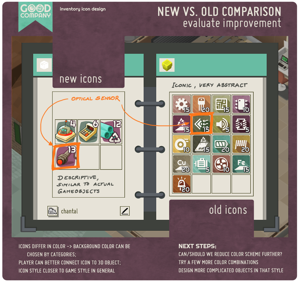
After discussing this iteration (see image below) with the others, we decided to continue with a combination of No.1 and No.2, keeping the level of accuracy and detail of Nr.1 and the background and shadow from No.2.
![]()
This was a good time to compare the progress we made on the new icons with the first version. You can see both in the image below. A first improvement is that now our icons are distinguishable at first glance. They have different colors and a bit of a spatial feel to them which increases uniqueness compared to the flat, white icons on the right. That also means that we do not need the background colors anymore to differentiate individual icons, but can use them to visualize item categories. Furthermore, the icons now resemble their corresponding 3D object, which makes it easier for the player to connect both representations. Overall the style of the items on the left is closer to the one found throughout the entire game so far, which helps to keep the style consistent.
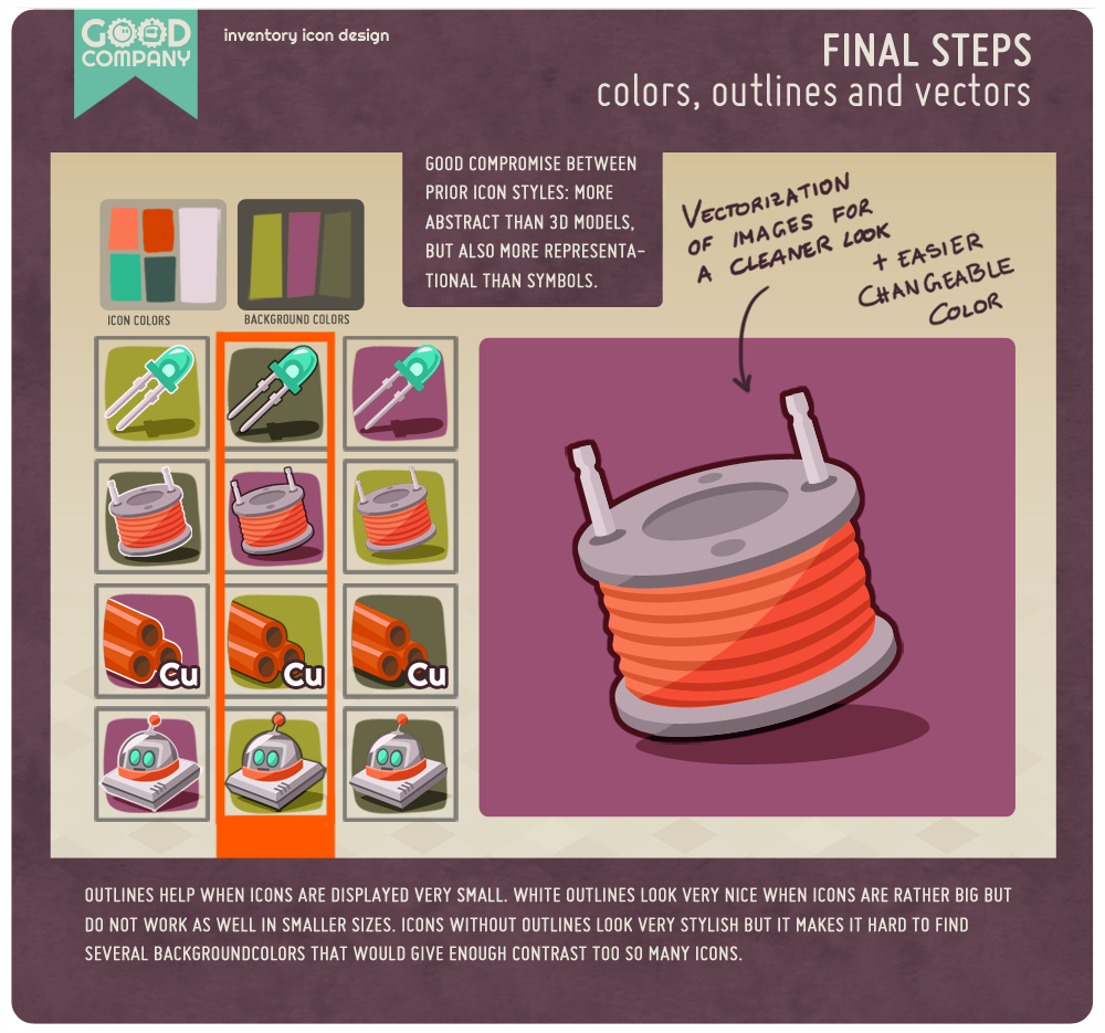
Until this stage, my icon designs were painted concepts. It was now time to polish the ideas, find a simple, good working color scheme, decide on outlines and vectorizing the icons so they look clean and color changes can be made quickly. I picked the colors from the overall color scheme of Good Company. The most representational approach would, of course, be to just use the colors objects have in the 3D world, but I am afraid that this would make the inventory menu look way too colorful and chaotic. So instead we are going to map item colors to the colors established for the inventory. This provides enough differentiation inside one object (hopefully, but in case we are in need for more colors in the future adding another color would not mess too much with the uniform look) while keeping a consistent look.
Since the icons will be displayed very small inside the inventory menu, they need to have enough contrast to their surrounding to pop out. In addition to light and bright colors, we chose to outline them with a dark color. White outlines would have been a nice reference to the cover image, as discussed before, but again, they are not very helpful from the far. I also like the designy look of using no outlines at all, but it makes it quite hard to find multiple colors that could be used in the background and that would create enough contrast to the icons even without outlines.
So, these are my notes on the process of finding a style for inventory icons in Good Company. In the end, it feels to me like this style choice should have been obvious from the beginning. But getting there takes some time, trial and error. But this feeling kind of confirms that the result works. To me at least 🙂